Showing all posts about design
How to define Australian food, if that is possible
15 July 2023
Australian food critic Besha Rodell, writing for The Sydney Morning Herald:
What is Australian food? Is there even any such thing? These are questions I’ve been pondering, researching and, at times, vigorously debating, for decades. We are not Europe. We are not Japan or Korea. Aside from the food of our incredibly diverse — and until recently, often ignored — First Nations cultures, we do not have thousands of years of edible history to draw upon and call our own. This makes the question harder to answer, but it also frees us from some of the bonds that tradition can impose.
I was once part of a community of design creatives called the Australian Infront, where all of these thoughts and questions were raised, except we were discussing design not food.
The group’s objective was to elevate the perception of Australian web design, as we felt the work of local designers was being overshadowed by designers, well, everywhere, but especially in North America and Europe. But we spent a lot of time trying to figure out what exactly Australian web design was, while also working out what it meant to be Australian.
Perhaps we should have framed the question/s from a food perspective instead.
RELATED CONTENT
The Loneliness Project, stories of loneliness curated by Marissa Korda
11 July 2023
I’m a little late to the party, the Loneliness Project, by Canadian graphic designer and illustrator Marissa Korda, has stopped publishing stories, but previous editions remain online for your reading enjoyment. I have to say I like the way each story is presented as a different apartment building (go to the website and see what I mean).
But the idea people can still be lonely, even though they live among a group of others, albeit separated by the wall of their dwellings, is poignant. Certainly, someone residing alone in an isolated house in a remote region may experience loneliness, but that it may happen in such close proximity to others seems unthinkable, even though of course it happens all the time.
But you don’t need to live alone, and not know your neighbours, to feel lonely. As these anecdotes about loneliness go to show, you can be surrounded by people, and still feel utterly alone.
And perhaps tangentially related, loneliness, particularly among young adults, has seen a rise in the number of friend-finder apps, not dissimilar to the likes of dating apps such as Tinder and Bumble.
RELATED CONTENT
The AIGA best book and cover designs of 2022 unveiled
8 July 2023
The American Institute of Graphic Arts (AIGA) has announced the winners of the 2022 50 Books | 50 Covers competition. Almost five-hundred covers, from twenty-seven countries, were submitted for consideration in the annual contest, which commenced one hundred years ago, in 1923. The fifty winning entries can be seen here.
RELATED CONTENT
The Tiny Awards, celebrating a small, playful, heartfelt web
7 July 2023
Voting is open in the inaugural Tiny Awards, which honour websites that embody “the idea of a small, playful and heartfelt web.” Nominees include the html.review, which I wrote about in April 2022, and ooh.directory, a blog directory, where disassociated is listed. Voting closes on Thursday 20 July 2023, with the winner being announced the next day.
RELATED CONTENT
blogs, design, IndieWeb, technology
archives.design, an archive of graphic design by Valery Marier
28 June 2023
archives.design is a digital archive of graphic design related items found on the Internet Archives, curated by Canadian graphic designer Valery Marier. This is a great resource.
RELATED CONTENT
design, graphic design, illustration
The 2023 Australian Book Design Awards (ABDA) winners
31 May 2023
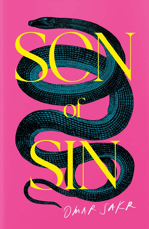
Book cover of Son of Sin, written by Omar Sakr, designed by Amy Daoud.
The Australian Book Design Awards (ABDA) not only judge books by their covers, they celebrate them, and last week the winners of the 2023 awards were announced. Son of Sin written by Omar Sakr, pictured above, won the Best Designed Literary Fiction/Poetry Cover award, with a cover created by Sydney based book designer Amy Daoud.
In other categories, Zeno Sworder, who both wrote, and designed the cover for My Strange Shrinking Parents, won the ABDA Cover of the Year prize, while ABDA’s Book of the Year award went to QUEER: Stories from the NGV Collection, with a cover by Dirk Hiscock and Karina Soraya, who both work at the National Gallery of Victoria.
All of the winning covers can be seen on ABDA’s Instagram page.
RELATED CONTENT
Australian literature, books, design, Omar Sakr, Zeno Sworder
ooh.directory a blogroll and web directory in the TikTok age
31 May 2023
My thanks to Phil Gyford for listing disassociated in his web directory ooh.directory. In the early days of the web, before search engines were a thing, website owners often sought to be added to web directories, as promotional opportunities were otherwise limited.
These website lists, or catalogues, were usually broken down by category or subject, so if, say, you were seeking websites focussed on literature, the books or literature page was the place to go. I used to while away many an hour perusing web directories. Site descriptions were often concise, to say the least, and on occasion there was no telling where a link might lead. There was a certain spontaneity that came with directories and blogrolls, something perhaps lacking in today’s web.
ooh.directory is also a blogroll. Once upon a time bloggers used to list their favourite websites and blogs, usually in a sidebar of their blog. Blogrolls were preceded by link pages, which served a similar purpose. They’re not seen so often today, as their use became frowned upon by the search engines. There was a concern some websites included on blogrolls and link pages might have been paid placements, potentially giving the listed blog an unsanctioned leg up in search rankings.
Web directories and blogrolls have been making something of a comeback recently. And in a world chock full of distractions, their return couldn’t be more timely. Elegant tools for a more civilised web. In addition to ooh.directory, there’s also the excellent feedle, the actual Blogroll, and FeedLand.
RELATED CONTENT
Blog publishing application WordPress has turned twenty
29 May 2023
When I re-launched disassociated as a blog in 2007, being one of many reboots this website has been subject to since 1997, I migrated to blog publishing application WordPress (WP). Prior to that, all pages here were laboriously hand coded. Hand coding was a hangover from my web design days, and my distaste for WYSIWYG website editors. My beef, at the time, with many of these webpage builders was the way they worked. Best practice, and standards, were an alien concept to them, to say nothing of the extraneous code they generated.
One, that shall remain nameless, created rollover code for text hyperlinks using JavaScript. JavaScript. This despite the web being well into the age of CSS generated rollover code by that stage. Come 2007 though, apps like WP were the way to go. Other bloggers I was speaking to then told me WP, or similar such CMSs, would save a bundle of time, and allow me to go about my disassociated way. I’m sure glad I listened to them. “WP is working for me, even while I sleep,” one counterpart said.
I was sold. By that stage WP had been around for about four years, but was still regarded as being relatively new. It was enough to make me feel as if I were some sort of (sort of) pioneer. But WP frustrated the hell out of some people. Many felt WP’s core capabilities were lacking, necessitating an over dependence on plugins — small apps that add, or extend to, WP’s functionality — to bring about the website, or blog, they desired. Ben Barden, a developer and blogger, once created his own CMS, back in the day, named Injader, for this reason.
But I’ve always strived to keep the backend as simple as the front. My use of plugins is as minimal as the interface design. All I want to do is write and post content. But here we are in 2023. disassociated, still styled (mostly) with a lowercase d, which first came into being in 1997 (not as a blog, the term was yet to be coined), is, despite stops and starts, still publishing. And this week WP is twenty years old. So, happy birthday WordPress, and thanks for being here. I’m looking forward to your thirtieth, which will really be something if disassociated is still doing its thing.
RELATED CONTENT
blogs, design, history, technology
How to design 1999-like websites in 2023
23 January 2023

Websites designed in the late 1990’s, especially personal sites, like the in-your-face Geocities pages, might have been inaccessible, difficult to navigate, devoid of standards, and completely lacking in latter day best practice methodology, but they were fun. Bold. Colourful. Non-generic.
Professional web designers of the time may have hated them, but I dare say they loved to hate them. And they might be about to again. British web engineer Sophie Koonin — who built her first Geocities page at age ten — is on a mission to bring the flamboyant and weird back to the web.
This time though without the HTML markup hacks, and proprietary code, of twenty-five years ago:
I’d love to see this spirit return today – the experimental and fun side of the web. My goal is to show you how we can be just as creative today but using modern and accessible methods. Because, as fun as they were, old websites were a nightmare for accessibility. We didn’t really use semantic HTML, we used tables for layouts (instead of, y’know, tabular data), everything was constantly flashing and moving. Luckily for us, the modern web allows us to be just as creative while still considering the user at the other end of the browser.
Talking of websites built during the nineties, I found out the other day that entropy8 (screenshot above), an example of beautiful website design from the era, built by Rome, Italy, based American digital artist and sculptor, Auriea Harvey, is still online. I used to visit entropy8 a bit, back in the day. Websites designed by artists are also what the web needs more of.
RELATED CONTENT
2023 the year of the RSS reader for email newsletters?
27 December 2022
While I trawl Twitter, Instagram, and other aggregator sites for news and information, I still also use Really Simple Syndication (RSS)… yes, I hear the laughter. If I had my way though, I’d rely solely on RSS, where every channel I peruse could be pulled into a single, convenient, interface. Trust me, reading the whole internet is so much easier when you only have to look at the one screen.
RSS, which, by the way, is really simple once you get the hang of it, allows you to read the content of any website, or social media platform for that matter, offering a RSS feed. But not everyone saw RSS as simple, and consequentially the technology has been out of mainstream favour for some time now. RSS developers were also at loggerheads as to the direction the syndication technology should take, while publishers were uncertain as to how they could monetise content served via RSS.
I’m also subscribed to about half a dozen newsletters, but I struggle to keep up with the many and myriad newsletters presently in circulation. And still some people say we’ve not yet reached “peak newsletter”. Really? I reached peak newsletter at least ten years ago. Having said that, I have vague plans to publish a newsletter here, but I’m not sure I want to inflict yet another newsletter on the world, as there’s surely enough of them already.
Imagine though you could read all your email newsletters by way of a RSS app. But you wouldn’t be seeing a web version of a particular email newsletter, something a provider like Mailchimp makes available. Instead, an email newsletter RSS app would pull the content of all the newsletters from your email in-box, and funnel them into the email RSS app. You’d then see your email subscriptions displayed in the same way as the RSS feeds of any websites you subscribe to are.
An email newsletter RSS reader just might make browsing all those newsletters a little more manageable. And the idea’s not so far-fetched either, says Nikki Usher, writing for NiemanLab, who thinks such an app is possible, various technical issues notwithstanding:
I predict that these people won’t stand for a universe where their email becomes ever more crowded just because of Elon Musk mucking up Twitter. The only way to survive in a world where multiple DC-insider publications are launching multiple newsletters and Twitter is no longer socially acceptable is to use an RSS reader that satisfies the intelligentsia and political elite.
Will we get it? It may well be that the feed from email to robust RSS reader needs an API that isn’t yet possible, given password-protected, your-and-Gmail’s-eyes-only email. RSS readers may need their own ecology of analytics in order to be commercially desirable and worthy of tech investment.
Might then 2023 be the year of RSS? Even if it is for email newsletters? It seems like a big call, but I’m watching this space. Might the current malaise towards the today’s centralised internet see RSS return to favour? Again, a big call, but who knows.
RELATED CONTENT